Page 1 of 1
Small 'acute' glyph in Maestro font
Posted: Fri Feb 03, 2017 4:33 pm
by Knut
Can anyone tell me what the purpose of the small acute glyph at key 'Capital G' (U+0047)?
I'm thinking it must serve (or at least have previously served) a substantial purpose, seeing as it's so easily available from the keyboard.
Anyway, I'd love to know what it is for.
Re: Small 'acute' glyph in Maestro font
Posted: Fri Feb 03, 2017 5:29 pm
by David Ward
It looks (if used at 24 point, or thereby) a bit like the sign used by Schoenberg and others to indicate a misplaced strong beat. Its opposite (a weak beat where one might expect a strong) is a shallow 'u' (or u-like) articulation.
That's my guess, but …
Re: Small 'acute' glyph in Maestro font
Posted: Fri Feb 03, 2017 5:34 pm
by motet
The ASCII correlations are mnemonic rather than based on importance or convenience. E is eighth note, H half note, C cut time, ampersand is treble clef, # is sharp, etc. My guess would be that the G character is used to slash grace notes.
Re: Small 'acute' glyph in Maestro font
Posted: Fri Feb 03, 2017 5:45 pm
by motet
...but apparently I'm wrong. The grace-note slash is thinner and longer. Could be that G was just a left-over spot. The Finale manual is no help--it just says "Acute".
Re: Small 'acute' glyph in Maestro font
Posted: Fri Feb 03, 2017 6:02 pm
by Knut
David Ward wrote:It looks (if used at 24 point, or thereby) a bit like the sign used by Schoenberg and others to indicate a misplaced strong beat. Its opposite (a weak beat where one might expect a strong) is a shallow 'u' (or u-like) articulation.
That's my guess, but …
Thanks, David.
A representation of the stress mark was my first thought as well, but the acute has a completely different shape (the stress mark looking more like a staccatissimo at a 45° angle) and seems too slight to have much of an impact above a notehead at 24pt.
It kind of makes more sense visually when attached to a stem. but for what purpose I don't know. I'm also a bit confused by the description used in the maestro character map; 'Acute' which seems to indicate that it is meant to serve as a 'general purpose' diacritic, but this explanation seems unlikely to me.
Re: Small 'acute' glyph in Maestro font
Posted: Fri Feb 03, 2017 6:09 pm
by Knut
motet wrote:...but apparently I'm wrong. The grace-note slash is thinner and longer. Could be that G was just a left-over spot. The Finale manual is no help--it just says "Acute".
I also considered it to be a grace note slash, but reached the same conclusion as you did.
It might be a leftover character, but so is the upper- and lower case D, as well as many of the diacritics.
I've posted the same question on the zendesk board. Hopefully someone from MakeMusic knows what it's for. (Although, my post has already received a vote of -1, so the again, maybe not.
Re: Small 'acute' glyph in Maestro font
Posted: Fri Feb 03, 2017 6:56 pm
by motet
I meant that perhaps the slot was left over after mnemonics were considered. It seems likely that some musical use was originally intended. It could be that it was a grace-note slash in ancient times until they did it a better way. I notice the newer Engraver font no longer has it.
Re: Small 'acute' glyph in Maestro font
Posted: Fri Feb 03, 2017 7:11 pm
by motet
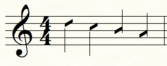
I found a print-out of an old document made with Petrucci. Here I've placed the character underneath the staff. It's plausible, I think, though the angle might not be quite right.

- slash.png (11.43 KiB) Viewed 11452 times
Re: Small 'acute' glyph in Maestro font
Posted: Fri Feb 03, 2017 7:50 pm
by N Grossingink
I seem to recall a similar character used as a phrase marking. Placed above the staff, used much as one would use the more common "breath mark".
N.
Re: Small 'acute' glyph in Maestro font
Posted: Fri Feb 03, 2017 8:04 pm
by Knut
Ah, I see what you mean. I doubt very much that it has ever served as a grace not slash though; for that it's much too narrow compared to the flag widths.
The acute in Petrucci is indeed longer than the one in Maestro, but then again, the flags in Petrucci are much wider than those in Maestro, so the glyph doesn't work as a grace note slash in Petrucci either.
Re: Small 'acute' glyph in Maestro font
Posted: Fri Feb 03, 2017 8:06 pm
by Knut
N Grossingink wrote:I seem to recall a similar character used as a phrase marking. Placed above the staff, used much as one would use the more common "breath mark".
N.
That's interesting. Although it begs the question why the symbol wasn't included in the same section as the breath marks in the character map.
Re: Small 'acute' glyph in Maestro font
Posted: Fri Feb 03, 2017 8:31 pm
by zuill
It seems to me that ages ago the small slash through the stem may have been an early way of notating a ghost note. I may be wrong. In Sprechstimme, both x's and the single small slash are used, from what I recall.
Zuill
Re: Small 'acute' glyph in Maestro font
Posted: Fri Feb 03, 2017 8:42 pm
by motet
Maybe G is for ghost!
With some stem connections it would work as a notehead.
- 0094.png (147.5 KiB) Viewed 11426 times
Re: Small 'acute' glyph in Maestro font
Posted: Fri Feb 03, 2017 8:48 pm
by zuill
I believe the slash was used to indicate a less spoken sound, and closer to a sung sound.
Zuill
Re: Small 'acute' glyph in Maestro font
Posted: Fri Feb 03, 2017 8:51 pm
by Knut
motet wrote:Maybe G is for ghost!
With some stem connections it would work as a notehead.
0094.png
That might be it. I can't recall ever seeing ghost notes notated this way, though.
Re: Small 'acute' glyph in Maestro font
Posted: Fri Feb 03, 2017 8:54 pm
by Knut
zuill wrote:I believe the slash was used to indicate a less spoken sound, and closer to a sung sound.
Zuill
Again, that is also very plausible, as completely spoken words are usually indicated by x noteheads.
If you have an example of this use of the symbol, I'd very much like to see it.
Re: Small 'acute' glyph in Maestro font
Posted: Fri Feb 03, 2017 9:12 pm
by zuill
Hard to find an example, as copyright is an issue. Here's a link to an article:
https://courses.lumenlearning.com/music ... echstimme/
This quote is found near the bottom of the page:
"Berg notates several degrees of Sprechstimme, e. g. in Wozzeck, using single-line staff for rhythmic speaking, five-line staffs with x through the note stem, and a single stroke through the stem for close-to-singing sprechstimme."
Zuill
Re: Small 'acute' glyph in Maestro font
Posted: Fri Feb 03, 2017 9:21 pm
by zuill
As far as ghost notes, I didn't say as a notehead. I meant as a slash through the stem.
Zuill
Re: Small 'acute' glyph in Maestro font
Posted: Fri Feb 03, 2017 9:28 pm
by motet
Wouldn't they look like eighth note slashes, though. The x's used on the stem by Schoenberg are smaller. This thing is notehead-sized.
Re: Small 'acute' glyph in Maestro font
Posted: Sat Feb 04, 2017 7:10 pm
by Knut
Thank you for your input, guys.
I found the semi-spoken technique, dubbed 'Halb gesungen' in Berg's Lulu. There, the slash looks like a diminished tremolo slash, much heavier than the acute in Maestro. Then again, due to the plate engraving, the whole look is heavier, so the Maestro acute does make some sense as a representation of this technique in the context of the font weight (although it's definitely on the thin side).
The categorization of the symbol still seems strange though, but it could be explained by multiple semantics.