Page 1 of 1
Sixteenth with shorter stem
Posted: Thu Apr 13, 2017 9:59 pm
by jose oscar
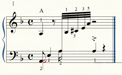
On the 3rd beat, Left hand, the sixteenth note, A, has a shorter stem than usual. Why?
I appreciate your help
Finale 2014/Wndows 7
Re: Sixteenth with shorter stem
Posted: Thu Apr 13, 2017 10:37 pm
by motet
How did you do the cross-staff note? How did you make the 16th flag (and shouldn't it be a 32nd flag to match the RH beaming)? Strangely, if I show layer 1 only, it looks like this:

- 0136.png (95.57 KiB) Viewed 8530 times
Re: Sixteenth with shorter stem
Posted: Thu Apr 13, 2017 10:43 pm
by motet
In any case, you can fix it with the stem-length tool, pulling down the handle shown:

- 0137.png (64.07 KiB) Viewed 8529 times
Re: Sixteenth with shorter stem
Posted: Thu Apr 13, 2017 11:03 pm
by jose oscar
Thank you very much. motet.
1."How did you do the cross-staff note?"
In the usual way
2. "How did you make the 16th flag (and shouldn't it be a 32nd flag to match the RH beaming)?"
It's a 16th flag, beacuse it begins to the second voice, tha has a (hidden) 16th rest to complete the beat n. 2 of the measure.
The route then is:
TOOLS menu/Advanced tools/Special tools/Stem length
Re: Sixteenth with shorter stem
Posted: Thu Apr 13, 2017 11:46 pm
by motet
Actually, all you need do is use Clear Selected Items to clean up the mess on the sixteenth note, then flip the 16th with the stem direction tool. I think what you had before is wrong and won't travel well.
- 0139.png (213.32 KiB) Viewed 8515 times
Re: Sixteenth with shorter stem
Posted: Fri Apr 14, 2017 11:40 am
by Peter Thomsen
My shot at the layout.
1) I would not hide the 16th rest.
2) I switched Layer 1 and Layer 2.
3) I extended the stems on the flagged notes - to avoid collision with the noteheads.
Re: Sixteenth with shorter stem
Posted: Fri Apr 14, 2017 12:38 pm
by John Ruggero
I think that the original stems direction is best because the true bass voice appears to be the dotted half note, and the player would play the upper left hand voice more lightly than if the stems are reversed as in Peter Thomsen's version. It is a matter of taste if the 16th rest appears. One might supply it if the sixteenth is to be released in an exact manner, but otherwise it might be omitted since the quintuplet fills out the rhythm satisfactorily.
A general plea concerning the finger numbers. One rarely sees anemic Times New Roman finger numbers like these in well-published music. If you will change the font to Maestro at 12 pts. you will have professional looking finger numbers.
Re: Sixteenth with shorter stem
Posted: Fri Apr 14, 2017 12:48 pm
by jose oscar
Thank you very much for your time, motet, Peter and John Ruggero
Re: Sixteenth with shorter stem
Posted: Fri Apr 14, 2017 12:54 pm
by jose oscar
jose oscar wrote:Thank you very much for your time, motet, Peter and John Ruggero
By the way, John, the score it's only for study, but it's an interesting remark that of the font for digitation.
How can I change the size of digits all together? I tried to do it but I only could do it one by one
Re: Sixteenth with shorter stem
Posted: Fri Apr 14, 2017 1:41 pm
by John Ruggero
jose oscar wrote:How can I change the size of digits all together? I tried to do it but I only could do it one by one
You are very welcome, jose. You must change the font and size of each the five finger number articulations (1, 2, 3, 4, 5) in turn in the Articulaton Designer that you can get to by double clicking on an articulation handle or by clicking anywhere while in the Articulation Tool to bring up the Ariculation Selection and going to Edit. This will then affect all the finger numbers in the piece. It s good idea to use metatools to insert finger numbers.
Re: Sixteenth with shorter stem
Posted: Fri Apr 14, 2017 4:40 pm
by jose oscar
Thank you very much, John.
The route is, then:
1. Double clicking on an articulation handle: Articulaton Designer
2. Set Font/ Italics - Size: 12/ OK
Re: Sixteenth with shorter stem
Posted: Fri Apr 14, 2017 6:56 pm
by Peter Thomsen
jose oscar wrote:… the score it's only for study, but it's an interesting remark that of the font for digitation …
Since the score is for study only, there is no need to imitate any particular publisher style.
Instead, consider a practical font choice:
1) The numbers should have a distinctive look so that you do not confuse them with other items, such as
- repeat ending numbers
- measure numbers
- string numbers
- fret numbers
- &c.
2) The numbers should be easy to read.
Generally, it is easier to stack fingering numbers without number collisions if you use italic font style.
Here are some examples.
You be the judge:
Re: Sixteenth with shorter stem
Posted: Fri Apr 14, 2017 8:57 pm
by jose oscar
Thank you, Peter,
One more thing I've learnt
Re: Sixteenth with shorter stem
Posted: Sat Apr 15, 2017 3:05 am
by John Ruggero
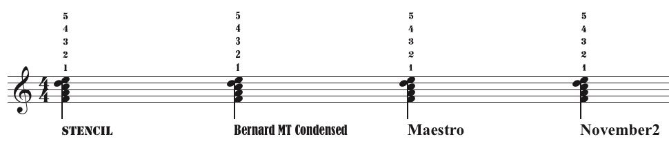
I must respectfully disagree with Peter Thomsen concerning the fonts for finger numbers in piano music. When one looks through the finger numbers in the piano music of not one but all the major publishers: Peters, Schirmer, Henle, Wiener Urtext, Breitkopf und Haertel, Alfred etc. one will find nothing but thick non-italic serif fonts, which look very much like the Maestro numbers. Why? Because generations of publishers and players prefer these numbers for their compactness and their visibility. It is for the same reason that the same style of number is stacked to create the time signature: they stand out like a sore thumb, and they stack so well. Smaller versions of these numbers are traditionally used for first and second endings and even smaller for the numbers in metronome indications. Italics are often reserved now for measure numbers and tuplet indications, so there will be no confusion with the fingering.
The only time italics and sans-serif fonts are used for piano fingering is when an edition must distinguish between the fingering of the editor vs. that of the composer, as in some editions of the works of Chopin. In the Paderewski edition of Chopin's Etudes, for example, the composer's own fingering is given pride of place by being presented in a non-italic serif font of the type well-represented by the Maestro numbers. The editor's fingering is relegated to second place by being engraved in a thin, sans-serif, italic font.
Re: Sixteenth with shorter stem
Posted: Sat Apr 15, 2017 8:27 pm
by Peter Thomsen
Here is a font comparison, showing some fonts of the type John Ruggero mentions:
- Fingering font discussion-2.jpg (30.75 KiB) Viewed 8423 times
Maestro and November2 are music fonts.
Re: Sixteenth with shorter stem
Posted: Sat Apr 15, 2017 10:06 pm
by John Ruggero
Thanks, Peter, for the added examples. In actual practice, the numbers would be stacked much closer to each other than shown in these examples.
Another reason that these numbers are used universally is because of their compactness. They get the message across, but limit the damage even in very complicated cases where there is a danger of the editing overwhelming the music itself, as in this example from Busoni's edition of Bach's Well-tempered Clavier: