Page 1 of 1
plus sign for composite meters - font?
Posted: Sun Apr 23, 2017 12:53 am
by meb
In setting document options for the Plus sign in time signatures, I am unable to find a font that does this correctly.
I tried about six music fonts (incl. some from Sibelius), but in every case I got this letter:
Ê
instead of a plus sign.
I can get a plus sign from Wingdings2, but the sign sits on the 5th line. Better than nothing, but not standard.
Does anybody have a fix for this?
Thanks in advance.
Re: plus sign for composite meters - font?
Posted: Sun Apr 23, 2017 1:04 am
by N Grossingink
What's wrong with the default?
N.
- CompTime.png (110.81 KiB) Viewed 3946 times
Re: plus sign for composite meters - font?
Posted: Sun Apr 23, 2017 2:34 am
by meb
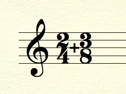
The default WOULD be great, but I can't get the plus sign to show up.
I.e. the PLUS sign is invisible. The signature looks like this:
- Bad time sig2.jpg (10.9 KiB) Viewed 3936 times
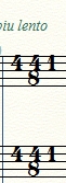
If I use Maestro, Opus, Reprise, Helsinki, Engraver, Jazz (did I forget any?), I get nothing, nada.
I can get a plus sign only if I use Wingdings 2, as shown next.

- Bad time signature.jpg (6.85 KiB) Viewed 3936 times
Thanks for letting me know that it usually works. I'm nonplussed.
Re: plus sign for composite meters - font?
Posted: Sun Apr 23, 2017 3:18 am
by motet
Can you post a file exhibiting the problem?
Re: plus sign for composite meters - font?
Posted: Sun Apr 23, 2017 3:22 am
by motet
What is Document Options / Time Signatures / Plus Sign Character set to? Don't use the ASCII plus sign at slot 43. Instead, you want 246 in the Maestro font.
Re: plus sign for composite meters - font?
Posted: Sun Apr 23, 2017 4:04 am
by meb
Hmm. You just pointed me down a different path. I went to Document Options/Fonts/Notation/Time Signature Plus Sign.
That only offers a change of fonts.
When I go to Document Options/Time Signatures I see the array of characters!
I reset the font to Maestro, chose ASCII 246 and then ASCII 132. Neither were satisfactory in the offending file.
Now what I "see" on the score looks like a vertical line. The horizontal part of the plus just doesn't show up well enough to see unless I enlarge the screen enormously, and I don't think that's going to pass muster in print.
Meanwhile, I went to a different file, tested a measure of composite meter, and the plus sign showed up just fine. Maybe I have a gremlin in my file.
Here's what these two files look like, so you can see why I don't like Example Two.
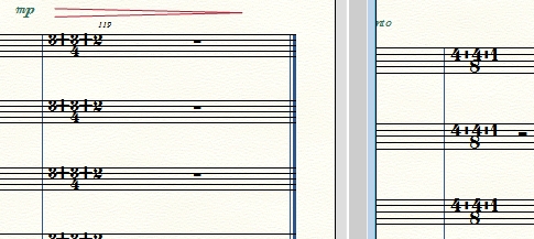
- Is there a way to nudge the + lower?
- CompositeTimeSignatureComparison.jpg (79.27 KiB) Viewed 3926 times
Thanks for reminding me to check Font options.
Re: plus sign for composite meters - font?
Posted: Sun Apr 23, 2017 5:22 am
by zuill
If we could see your file, we could put this to rest. Here's what it can look like. Something is off in one of your settings. We can probably find it for you.
Zuill
Re: plus sign for composite meters - font?
Posted: Sun Apr 23, 2017 5:26 am
by motet
To me the plus signs on the left in meb's last posting look too big.
I think this is just a question of screen resolution/aliasing. It doesn't look good at 100% zoom on my fair to middling system, either. 200% looks good (both shown below). But it will print fine.