General notation questions, including advanced notation, formatting, etc., go here.
Moderators: Peter Thomsen, miker
-
soundcardB
- Posts: 25
- Joined: Sat May 05, 2018 8:06 am
- Finale Version: Finale 2014
- Operating System: Windows
Post
by soundcardB » Thu Apr 22, 2021 8:09 pm
Hi,
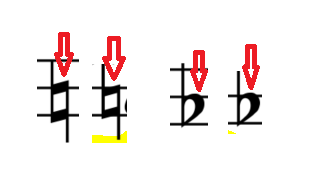
i was wondering why the natural with arrow up from finale percussion font has different dimensions from maestro font natural, flats and sharps of maestro font are same size of flats and sharps with arrows of the maestro percussion font...
Any idea?
here the screen

-
Peter Thomsen
- Posts: 6626
- Joined: Fri Jul 25, 2003 6:47 pm
- Finale Version: Finale v27.4
- Operating System: Mac
Post
by Peter Thomsen » Thu Apr 22, 2021 8:31 pm
My guess ia that it is a matter of being consequent.
If you - instead - examine the arrow-less flat and natural accidentals, you will see a similar height difference at the stem top:
The (arrow-less) flat’s stem ends about one Point higher than the (arrow-less) natural’s stem.
Mac OS X 12.6.9 (Monterey), Finale user since 1996
-
soundcardB
- Posts: 25
- Joined: Sat May 05, 2018 8:06 am
- Finale Version: Finale 2014
- Operating System: Windows
Post
by soundcardB » Thu Apr 22, 2021 8:45 pm
Peter Thomsen wrote: ↑Thu Apr 22, 2021 8:31 pm
My guess ia that it is a matter of being consequent.
If you - instead - examine the arrow-less flat and natural accidentals, you will see a similar height difference at the stem top:
The (arrow-less) flat’s stem ends about one Point higher than the (arrow-less) natural’s stem.
no... the flats symbols are very similar, the natural one if you look at the "bold lines" are really different, it's not a matter or where the line finishes but how the symbol is represented... Also if you insert just the natural from maestro percussion it is identical to the maestro one but the natural with arrow up is different.
i don't know if i was clear enough...
-
soundcardB
- Posts: 25
- Joined: Sat May 05, 2018 8:06 am
- Finale Version: Finale 2014
- Operating System: Windows
Post
by soundcardB » Thu Apr 22, 2021 8:50 pm
oh ok, i now understood what you told... i misunderstanded.
Mmm yes, it could be but it continues to feel wrong to my eyes, but maybe it is just my perception, same symbol is on ligeti string quartet n.2 and it is the same as the normal natural but with arrow...
I also tried the one in the engraver font but the arrow is not noticeable, really a pity that there isn't the normal natural with arrow.
-
zuill
- Posts: 4418
- Joined: Sat Dec 10, 2016 9:35 pm
- Finale Version: Finale 2011-v26.3.1
- Operating System: Windows
Post
by zuill » Thu Apr 22, 2021 11:46 pm
The natural in Maestro Percussion without the arrows looks the same as in Maestro, but the shape with the up arrow and also the down arrow has a different shape than in Maestro. Curious that they didn't bother to match them.
Zuill
Windows 10, Finale 2011-v26.3.1
"When all is said and done, more is said than done."
-
soundcardB
- Posts: 25
- Joined: Sat May 05, 2018 8:06 am
- Finale Version: Finale 2014
- Operating System: Windows
Post
by soundcardB » Fri Apr 23, 2021 8:04 am
zuill wrote: ↑Thu Apr 22, 2021 11:46 pm
The natural in Maestro Percussion without the arrows looks the same as in Maestro, but the shape with the up arrow and also the down arrow has a different shape than in Maestro. Curious that they didn't bother to match them.
Zuill
exactly this is what makes me perplexed
-
zuill
- Posts: 4418
- Joined: Sat Dec 10, 2016 9:35 pm
- Finale Version: Finale 2011-v26.3.1
- Operating System: Windows
Post
by zuill » Fri Apr 23, 2021 1:35 pm
Have you reported this to MakeMusic?
Zuill
Windows 10, Finale 2011-v26.3.1
"When all is said and done, more is said than done."
-
soundcardB
- Posts: 25
- Joined: Sat May 05, 2018 8:06 am
- Finale Version: Finale 2014
- Operating System: Windows
Post
by soundcardB » Fri Apr 23, 2021 2:45 pm
No, but since i use an original license of finale 26, if you tell me how to do it i can do it from my account...
-
zuill
- Posts: 4418
- Joined: Sat Dec 10, 2016 9:35 pm
- Finale Version: Finale 2011-v26.3.1
- Operating System: Windows
Post
by zuill » Fri Apr 23, 2021 2:53 pm
Log in to your account, click on Contact Us, and there's a link there to submit a request.
Zuill
Windows 10, Finale 2011-v26.3.1
"When all is said and done, more is said than done."
-
soundcardB
- Posts: 25
- Joined: Sat May 05, 2018 8:06 am
- Finale Version: Finale 2014
- Operating System: Windows
Post
by soundcardB » Fri Apr 23, 2021 3:21 pm
DID IT, thanks

-
zuill
- Posts: 4418
- Joined: Sat Dec 10, 2016 9:35 pm
- Finale Version: Finale 2011-v26.3.1
- Operating System: Windows
Post
by zuill » Fri Apr 23, 2021 3:29 pm
Please let us know when they respond and what they say. It might be that things will get fixed if we have more users report the issue. In the past, we were able to get the Finale Lyrics font fixed when it was missing much needed characters that were omitted. They responded fairly quickly with a font update. However, when new versions of Finale came out, they went back to the old font. I keep the fixed font file for future use when a new version of Finale reverts back to the old, damaged font file.
Zuill
Windows 10, Finale 2011-v26.3.1
"When all is said and done, more is said than done."
-
soundcardB
- Posts: 25
- Joined: Sat May 05, 2018 8:06 am
- Finale Version: Finale 2014
- Operating System: Windows
Post
by soundcardB » Fri Apr 23, 2021 5:23 pm
zuill wrote: ↑Fri Apr 23, 2021 3:29 pm
Please let us know when they respond and what they say. It might be that things will get fixed if we have more users report the issue. In the past, we were able to get the Finale Lyrics font fixed when it was missing much needed characters that were omitted. They responded fairly quickly with a font update. However, when new versions of Finale came out, they went back to the old font. I keep the fixed font file for future use when a new version of Finale reverts back to the old, damaged font file.
Zuill
Yes
it would be great since it is not a very common symbol but also not very unused, useful for all a little bit high pitched sounds in flute multiphonics and so on
-
soundcardB
- Posts: 25
- Joined: Sat May 05, 2018 8:06 am
- Finale Version: Finale 2014
- Operating System: Windows
Post
by soundcardB » Mon Jun 07, 2021 12:27 pm
Ok they replied and told me that they are going to fix it in the next version of finale probably
-
BuonTempi
- Posts: 1307
- Joined: Fri Aug 20, 2010 8:59 am
- Finale Version: Finale 27
- Operating System: Mac
Post
by BuonTempi » Tue Jun 08, 2021 10:44 am
Presumably, the percussion symbols will all be in the new FinaleMaestro SMuFL font, and that will be where the fix is.

