Fat noteheads!
Moderators: Peter Thomsen, miker
I have an engraving request for some piano pieces. I sent two examples to the composer, however he wanted more fat note heads. I knew already that he wanted this so I used engraver font set. But the note heads were not fat enough for the composer. Does anybody know of a font that uses even more fat note heads than Engraver
-
Peter Thomsen

- Posts: 6628
- Joined: Fri Jul 25, 2003 6:47 pm
- Finale Version: Finale v27.4
- Operating System: Mac
Two ideas:
1) - try the font Maestro Wide (which is designed for “fatter” noteheads).
2) - try increasing the Notehead Font Size (it does not have to be 24 Points). Try e. g. 25 Points, or 26 Points.
1) - try the font Maestro Wide (which is designed for “fatter” noteheads).
2) - try increasing the Notehead Font Size (it does not have to be 24 Points). Try e. g. 25 Points, or 26 Points.
Mac OS X 12.6.9 (Monterey), Finale user since 1996
Thanks for input! I have tried both, and Maestro wide is not as fat as Engraver, and if I enlarge the font size to 25, the note heads exceeds one space.Peter Thomsen wrote: ↑Tue Aug 03, 2021 10:05 amTwo ideas:
1) - try the font Maestro Wide (which is designed for “fatter” noteheads).
2) - try increasing the Notehead Font Size (it does not have to be 24 Points). Try e. g. 25 Points, or 26 Points.
-
Peter Thomsen
- Posts: 6628
- Joined: Fri Jul 25, 2003 6:47 pm
- Finale Version: Finale v27.4
- Operating System: Mac
Indeed.
And you can see the same in manuscripts with very beautiful, readable handwriting.
I would not worry about noteheads extending slightly over the line.
Mac OS X 12.6.9 (Monterey), Finale user since 1996
-
elbsound

- Posts: 196
- Joined: Wed Aug 03, 2016 10:06 am
- Finale Version: Finale 2014.5
- Operating System: Windows
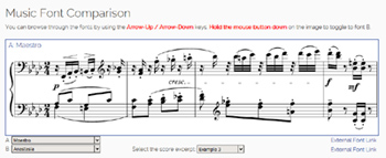
Have a look at my Music Font Comparison created with Finale.
Maybe you find will a better notehead there?
https://elbsound.studio/music-font-comparison.php
Maybe you find will a better notehead there?
https://elbsound.studio/music-font-comparison.php